The practical look, feel and voice of Garden Graphics 3D.
A short reference for keeping the brand aligned with the real CAD visuals: clear, grounded, useful and easy for customers to understand.
A clean 3D mark with a practical premium feel.
The logo now uses one consistent mark across the website: a simple modelled form, a subtle garden reference and a restrained gold detail. It should feel sharper and more polished without becoming flashy.
- Keep clear space around the mark equal to the height of the inner cube.
- Use the shared SVG mark so the header, footer, favicon and brand visuals stay consistent.
- Don't stretch, recolour with gradients, or add drop shadows.

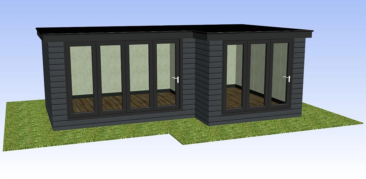
Warm neutrals, brick tones, roof grey and soft green.
The palette is taken from the CAD styles: off-white backgrounds, brick red accents, roof grey, soft stone and a muted green for buttons and highlights.
Clear, practical typography.
The typography should feel like a reliable specialist company: readable, calm and confident. It should support the CAD styles rather than compete with them.
Clear, plain-English copy that reads as confident and valuable — never hyped or cheesy.
Confident, clear and sales-aware.
Do
Speak plainly and practically. Explain how CAD visuals help customers understand the build, compare options and feel more confident before committing.
Don't
Avoid hype, futuristic language, luxury architecture styling or "cheap CAD" positioning. Do not make the website look more polished than the working visuals it showcases.
Core message: “Turn enquiries into clear CAD visuals that help customers say yes.”
Put the brand to work.
Buy your first pack of CAD Credits and start adding clear CAD previews to real customer conversations.